Top 10 Product Metrics Every Product Manager Should Track
Most product managers we know have dashboards that have talk, dozens of charts, colorful graphs, numbers everywhere. But when you ask them which metrics actually inform their decisions? Silence…
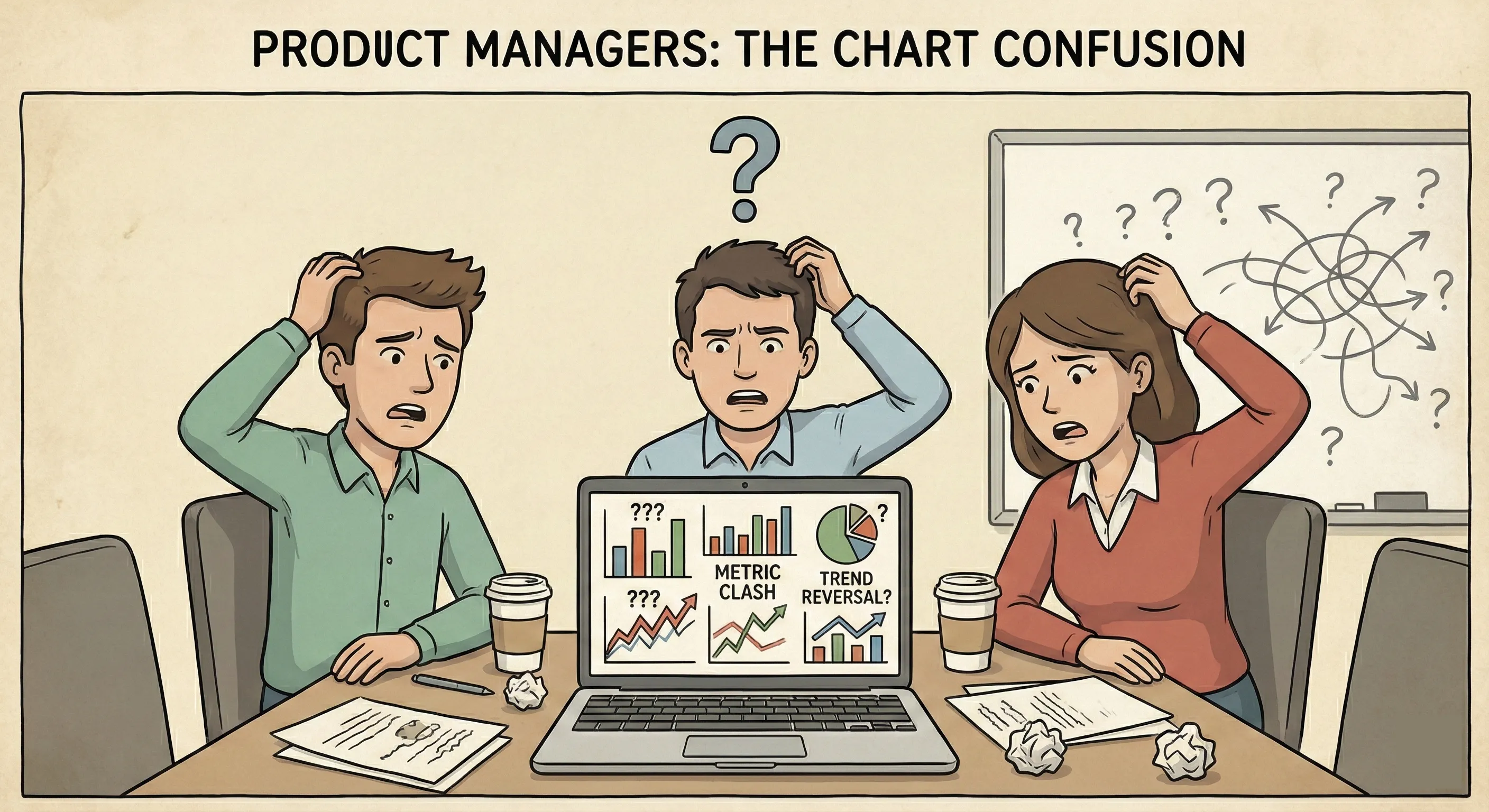
Here’s the thing: tracking everything is the same as tracking nothing.
We learned this by interviewing few of our users before onboarding them to Livedocs. They have built this beautiful dashboard with 27 different metrics. It took three hours every Monday morning to update, but they couldn’t tell you which number mattered most.
Were they supposed to celebrate when DAU went up 5% while retention dropped 2%? The contradictions were driving them nuts.
That experience taught us something crucial, less really is more when it comes to product metrics. What you need isn’t more data; you need the right data that tells a coherent story about your product’s health.
So let’s cut through the noise. These are the ten metrics that’ll give you a real insights on your product without drowning you in spreadsheets.
And you can simply done it with Livedocs. Livedocs is an advanced AI agent for data analysis, from question to result in seconds.
Monthly Active Users (MAU) and Daily Active Users (DAU)
Think of MAU and DAU as your product’s vital signs, but you can’t skip them.
But here’s where most teams mess up: they count anyone who just opens the app as “active.” That’s vanity metrics territory, friend. For a music streaming app, an active user should be someone who actually plays a song, right? For a CRM, maybe it’s creating or updating at least five customer records.
The magic happens when you calculate your DAU/MAU ratio. This tells you how “sticky” your product is. Facebook, for instance, has a ratio above 50%, meaning half their monthly users come back daily. That’s insane engagement. Most products? They’re happy with 20-30%.
How to track it: Define what “active” means for your product first. Then measure consistently. If you change your definition halfway through, you’re essentially starting over with your trend data.
The magic happens when you calculate your DAU/MAU ratio
Activation Rate
Let me paint a picture. Someone signs up for your product, full of hope and expectations. They log in, look around, and… nothing clicks. They leave, never to return. Sound familiar?
That’s what activation rate measures, the percentage of users who actually experience your product’s core value during their first session. It’s not about completing a tutorial or filling out a profile. It’s about that “aha!” moment where they get why your product exists.
- For Slack, activation is when a team sends 2,000 messages.
- For Dropbox, it’s putting a file in a shared folder.
What’s yours? A healthy activation rate sits somewhere between 25-40% for most SaaS products, though this varies wildly by industry. The key is knowing your number and relentlessly optimizing that first experience.
Pro tip: Map out your user’s journey from signup to that first moment of value. Then ruthlessly eliminate every unnecessary step in between.
A healthy activation rate sits somewhere between 25-40% for most SaaS products
Customer Retention Rate
Honestly, retention might be the most underrated metric in product management. Everyone gets excited about new signups, but nobody wants to talk about the leaky bucket problem.
Here’s the brutal truth: if you’re losing customers as fast as you’re gaining them, you don’t have a growth problem, you have a product problem. Retention tells you whether people find ongoing value in what you’ve built.
The math is straightforward:
(Customers at end of period - New customers during period) / Customers at start of period × 100.
But the insight? That’s where it gets interesting. Look at cohort retention, how different groups of users behave over time. Did users who signed up in January stick around better than March signups? Maybe you launched a killer feature in February that improved the experience.
Monthly retention above 90% is solid for B2B SaaS. Consumer apps face tougher odds, anything above 30% at the 90-day mark deserves a celebration.
Churn Rate
Churn is retention’s evil twin, it’s the percentage of customers who leave during a given period. We know it hurts.
Calculate it monthly: (Customers lost / Total customers at start of month) × 100.
But here’s what most product managers miss: not all churn is created equal. There’s voluntary churn (customers who actively cancel) and involuntary churn (failed payments, expired cards). The first tells you about product satisfaction; the second is often just an ops problem.
Also, 5% monthly churn might sound small until you realize that compounds to 46% annual churn. Yikes.
The best product teams I know don’t just track churn, they interview churned customers religiously. That qualitative data is gold. Why’d they leave? What would’ve made them stay? Sometimes the answer surprises you.
Net Promoter Score (NPS)
NPS gets a lot of hate in product circles, and yeah, it’s not perfect. But it’s still one of the quickest ways to gauge customer sentiment.
The question is simple: “How likely are you to recommend our product to a friend or colleague?” (0-10 scale)
- Promoters (9-10): Your champions
- Passives (7-8): Satisfied but uninspired
- Detractors (0-6): At risk of leaving
Your NPS is the percentage of promoters minus the percentage of detractors. Above 50 is excellent. Above 70? You’re killing it.
What makes NPS valuable isn’t the score itself, it’s the follow-up question: “Why did you give that score?” That’s where the real insights live. You’ll discover which features delight users and which ones frustrate them to no end.
Customer Lifetime Value (CLV or LTV)
If you’re not tracking CLV, you’re basically flying blind on pricing and acquisition strategy.
CLV tells you how much revenue you can expect from a customer over their entire relationship with your product.
The basic formula: Average revenue per user × Average customer lifetime.
Why does this matter? Because it determines how much you can spend to acquire a customer. If your CLV is $1,200 and you’re spending $1,500 on acquisition, that’s… not sustainable. The golden rule: CLV should be at least 3x your Customer Acquisition Cost (CAC).
Smart product teams segment CLV by customer type. Enterprise customers might have a CLV of $50,000 while SMB customers clock in at $5,000. That changes everything about how you prioritize features and support.
Customer Acquisition Cost (CAC)
Speaking of CAC, this one’s critical. It’s the total cost of acquiring a new customer, including marketing, sales, and onboarding expenses.
The math: (Total marketing + sales spend) / Number of new customers acquired.
What trips people up is defining the time period. Are you measuring CAC for customers acquired this month using this month’s spend? Or accounting for the lag between when you spend money and when you close deals? Both are valid, just be consistent.
A healthy CAC:CLV ratio is 1:3 or better. And you should recover your CAC within 12 months. If it takes longer, you might struggle with cash flow even if the unit economics work long-term.
Feature Adoption Rate
You know that feature your team spent three months building? The one the CEO was super excited about? How many users are actually using it?
Feature adoption rate = (Number of users who use the feature / Total number of users) × 100.
This metric keeps you honest about what’s working and what’s not. Low adoption doesn’t always mean it’s a bad feature, maybe it’s buried in your UI, or users don’t understand its value. But you need to know either way.
I like tracking adoption in 30-day windows after a feature launch. If adoption plateaus below 10%, that’s your signal to either improve discoverability, educate users better, or admit it wasn’t the priority you thought it was.
Monthly Recurring Revenue (MRR) and Annual Recurring Revenue (ARR)
For subscription products, MRR and ARR are your financial heartbeat. MRR is the predictable revenue you expect each month; ARR is that number × 12.
But don’t just track top-line numbers. Break it down:
- New MRR (from new customers)
- Expansion MRR (upgrades and upsells)
- Contraction MRR (downgrades)
- Churned MRR (lost customers)
Net new MRR = New + Expansion - Contraction - Churned.
This breakdown tells you whether you’re growing through new customer acquisition or expanding existing accounts. Both are good, but expansion MRR often has better margins since you’ve already covered the acquisition cost.
Time to Value (TTV)
How long does it take for a new user to experience meaningful value from your product? That’s your Time to Value, and it’s criminally undertracked.
Think about it: every day between signup and that first “win” is a day they might abandon ship. The shorter this window, the better your activation and retention will be.
For some products, TTV is minutes (Instagram lets you scroll and double-tap immediately). For others, it’s weeks (implementing an enterprise CRM). The key is knowing your number and continuously working to reduce it.
Track this by measuring the time from signup to your activation milestone. Then look for bottlenecks. Do users get stuck during setup? Is your onboarding too complex? Cut, simplify, streamline.
Making Metrics Actually Useful
Okay, so you’re tracking these ten metrics. Great start. But here’s what separates amateur product managers from the pros: synthesis.
Your metrics need to tell a story. If retention is dropping but activation is steady, what does that mean? Maybe your onboarding is fine, but your long-term value proposition is weak. If CAC is rising while CLV stays flat, you’ve got a unit economics problem brewing.
The best approach? Pick 2-3 primary metrics that ladder up to your business goals, then use the others as diagnostic tools. For a growth-stage SaaS company, that might be MRR growth (primary) with retention and feature adoption as secondaries.
And please, for the love of all that’s holy, make your dashboards simple. If your stakeholders need a PhD to interpret your weekly metrics report, you’ve failed.
Your metrics need to tell a story.
How Livedocs Simplifies Metric Tracking for Product Teams
Let’s be honest: building and maintaining dashboards is a pain. Pulling data from Stripe, your database, Google Analytics, Mixpanel, or Amplitude, then trying to wrangle it into spreadsheets or Tableau, it eats up your time.
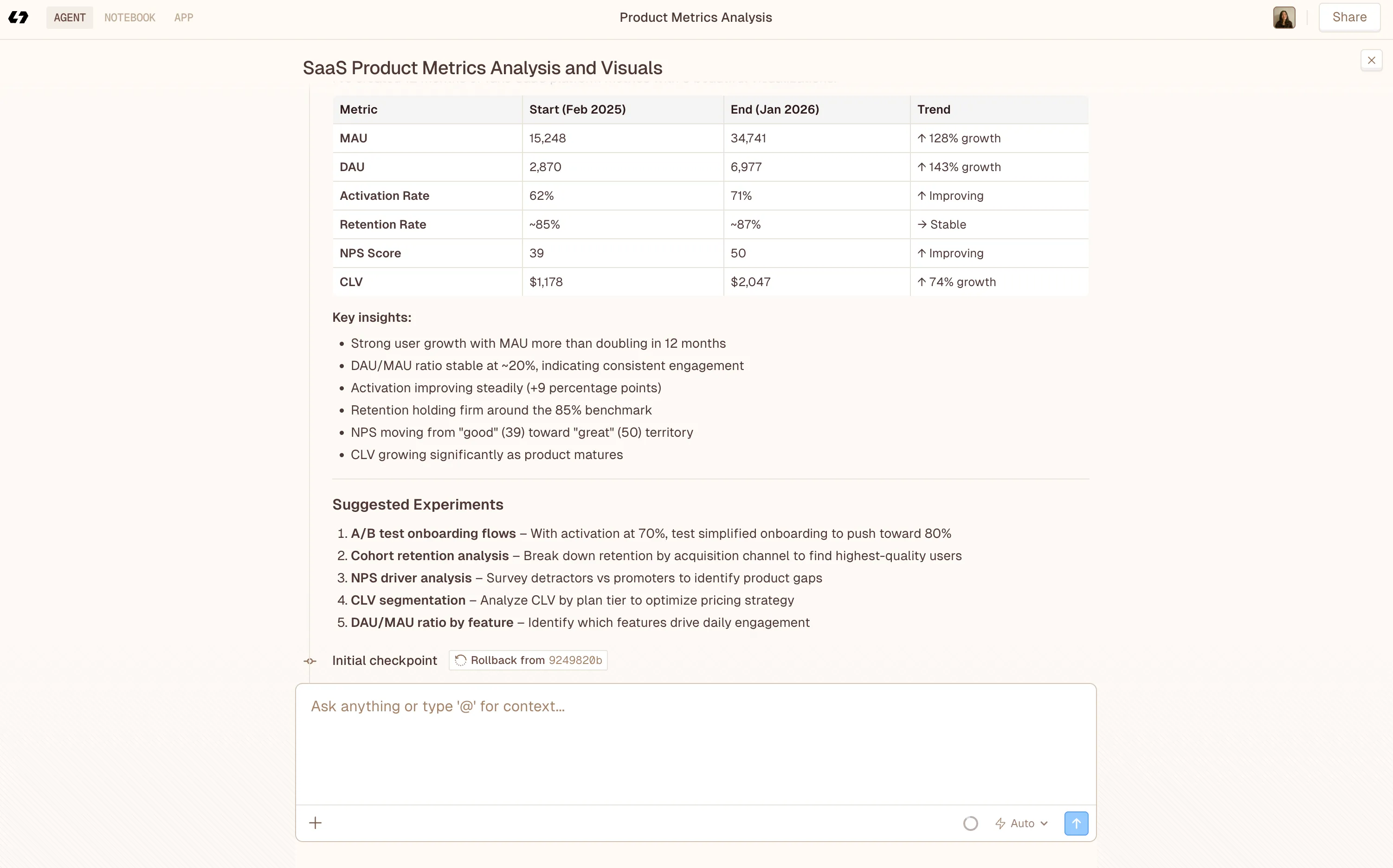
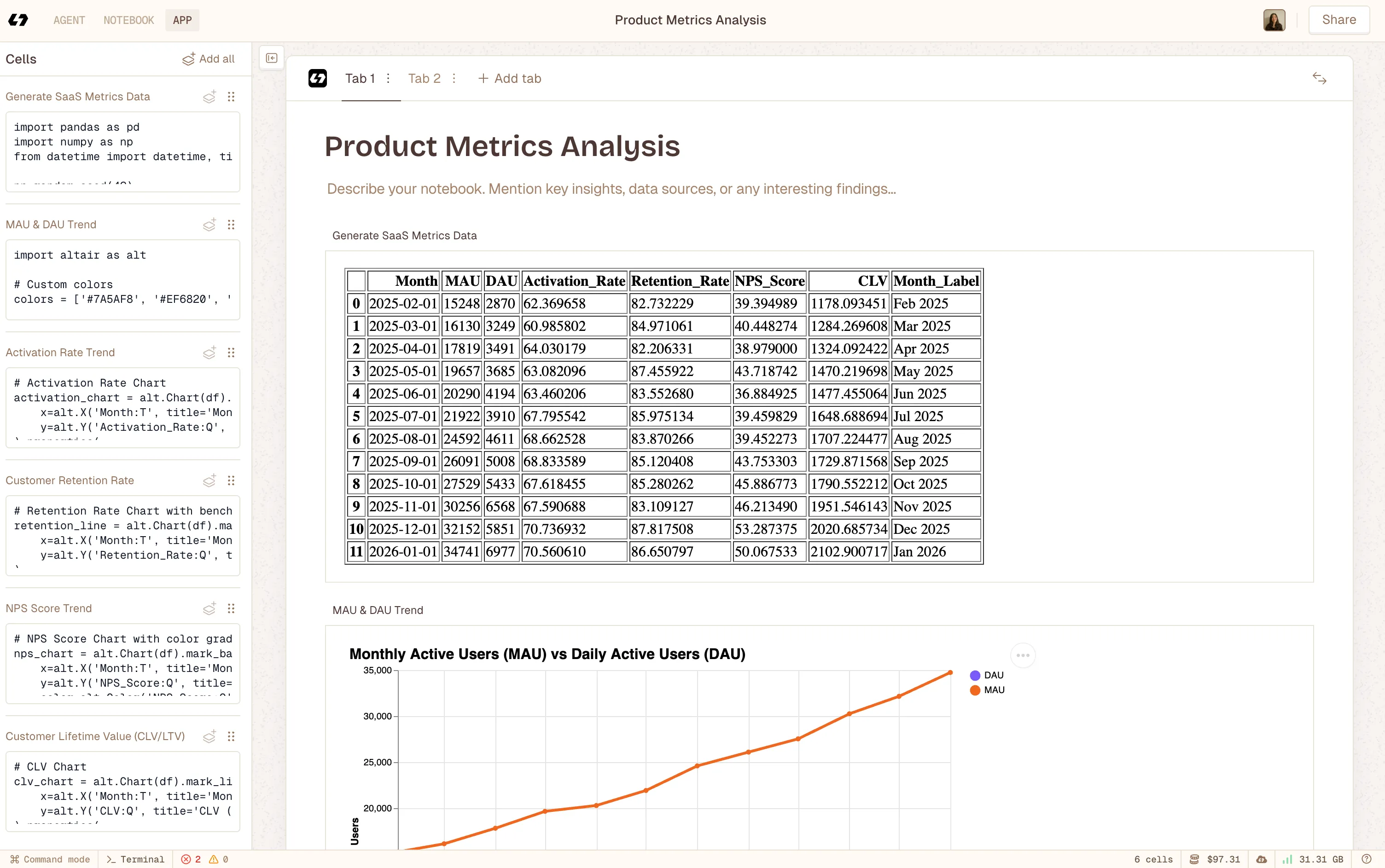 Using Livedocs to build notebook app after deep analysis with Livedcs Deep Agent.
That’s where Livedocs’ AI-powered Agent Notebooks come in. It is default tool for dealing with data and analysis.
AI can automatically generate charts, track key metrics like MRR, retention, and user engagement, and even highlight trends or suggest next steps. You get live, collaborative documents that combine your data with context, so your team understands not just what the numbers are, but why they matter and what actions to take.
No more emailing static reports or juggling multiple dashboards. Instead of context-less metrics like “Revenue: $50K,” you can build living documents that tell the story: “Revenue grew 15% this month driven by enterprise expansion, here’s our Q2 strategy to accelerate that trend.” The data updates in real time, and the context helps your team act faster and smarter.
For product managers who aren’t data scientists (most of us), Livedocs means focusing on insights instead of SQL. Your job is building great products, not dealing with dashboards, charts and analytics.
Final Thoughts
Tracking metrics isn’t the goal, better products are. Every metric you track should have a potential action attached to it. If retention drops below 85%, what do you do? If feature adoption is below 15% after three months, what’s your plan?
Metrics without action items are just numbers on a screen. Pretty, maybe. Useful? Not so much.
So start with these ten metrics, but don’t feel like you need to track all of them at once. Pick the 3-4 that align most closely with your current stage and goals. Master those first. Then expand.
And remember: the best metric is the one that changes how you build. Everything else is just decoration.
The best, fastest agentic notebook 2026? Livedocs.
- 8x speed response
- Ask agent to find datasets for you
- Set system rules for agent
- Collaborate
- And more
Get started with Livedocs and build your first live notebook in minutes.
- 💬 If you have questions or feedback, please email directly at a[at]livedocs[dot]com
- 📣 Take Livedocs for a spin over at livedocs.com/start. Livedocs has a great free plan, with $10 per month of LLM usage on every plan
- 🤝 Say hello to the team on X and LinkedIn
Stay tuned for the next article!
Ready to analyze your data?
Upload your CSV, spreadsheet, or connect to a database. Get charts, metrics, and clear explanations in minutes.
No signup required — start analyzing instantly